
Designers of the signs that guide you
I'm starting a new full-time (freelance) job in two weeks here in London. It's with a digital product agency called Made by Many and I can't wait to be one of the Many... who makes web things. My transition to the new job is making me pause and reflect on some of the experiences I've had.
I came across this article today when I randomly looked up Glen Cummings on Twitter - an oldie but goodie. Quite possibly the only NY Times article, ever, to bring attention to designers of signage and wayfinding systems. The Ruedi Baur-designed Vienna airport is probably the most famous example of a graphic system with character in an airport.

Vienna airport signage system designed by Ruedi Baur (gracias NY Times)
The large bold letters are slightly fuzzy but still legible and I love how the green exit signs pop out against the grays and whites. Unfortunately most airports don't give quite as much attention to the graphic quality of their signs. And this is to the detriment of all of us, as the loudest visual component are the advertisements on every imaginable surface. In fact, I'm surprised they haven't figured out a way to advertise on the side of airplanes.
When I was living in Spain early last year I worked with Base Design on a signage system for a recently renovated building in Madrid, and my contribution to the proposal helped us win the contest by the government of Madrid and architecture organization COAM.
Our concept was really minimal. Since the building has so many different types of materials - three different woods, metal and floor to ceiling glass - we wanted to let the building "speak" to guide people on their way around. So all of the text and icons would be in relief, raised from the walls of the building. Another aspect was that all of the arrows would bend around the columns and corners, literally folding itself around the building structure.

The super modern renovation in the historic neighborhood of Malasaña

I spent a lot of time creating databases like this, which would explain how the signage system works to the client and also the production team. For every floor we determined a code and placement for the sign, then mocked up a panel to show what the sign would look like.
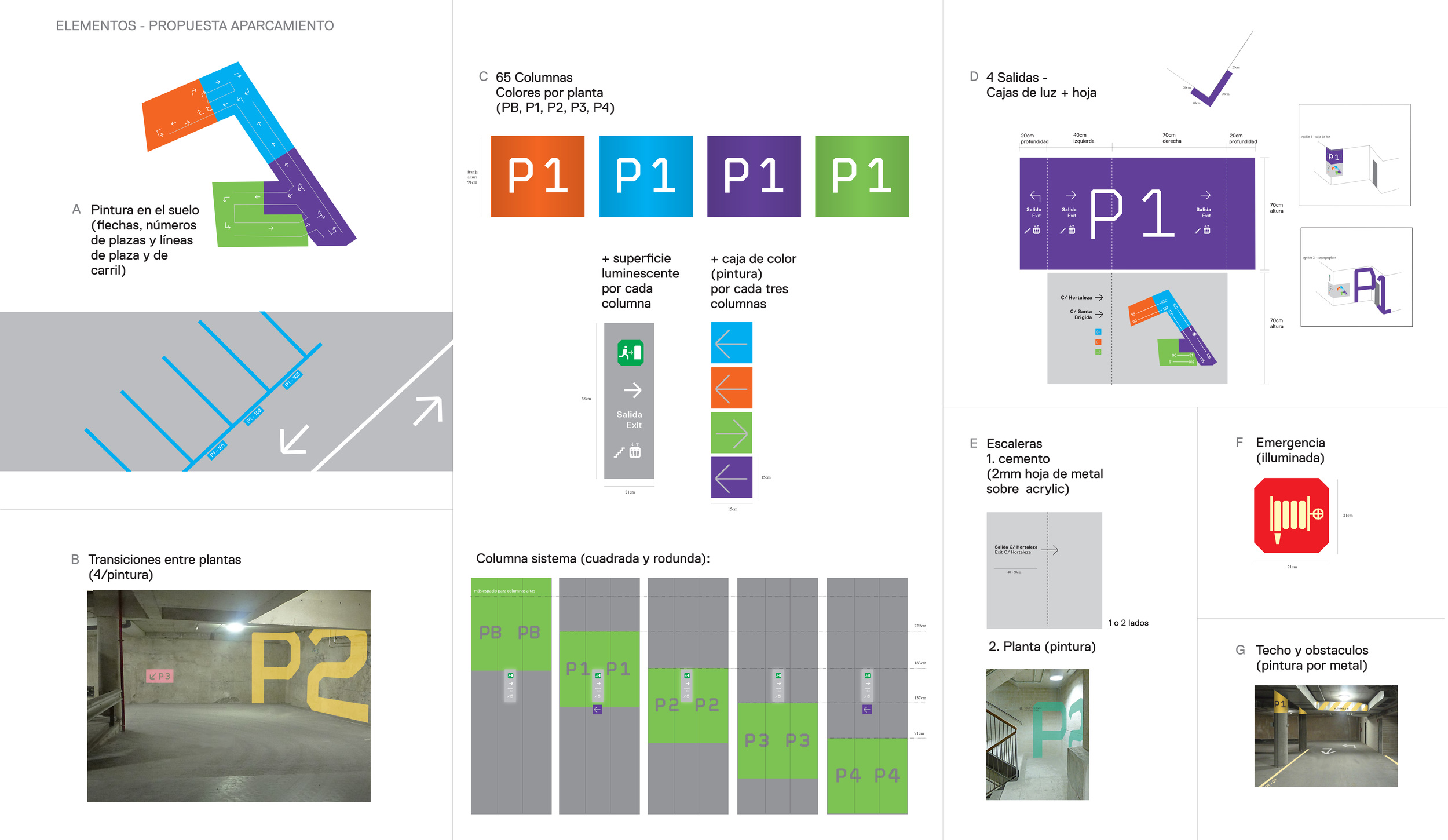
The concept for the parking garage was a bit more lively. We chose vibrant but dark shades of four different colors, then divided the five levels of the parking garage into four color-coded sections based on the exits. As you drive down into the garage, the stripe on the columns gets slightly lower, so you have a visual cue as to what level you're on in addition to the number. Continuing the concept of using the building materials from the upstairs, the numbers fold around the square columns so that you read it in full on a diagonal.
I was really looking forward to seeing this in action, but unfortunately the Spanish economy ate this project and I won't ever see the fruits of my labor. And especially now that Base doesn't even operate in Spain anymore! At least I learned a little Spanish.